
I recently participated in a discussion with colleagues about Google Search Console. In fact, the conversation was about Looker Studio and how we could leverage the information we extracted from Google Search Console with the Looker connector. However, as is often the case in such discussions, it veered towards the reliability of Looker’s data. One of the participants expressed confusion about the query data extracted from Google Search Console, and from there, we realized that there is a certain level of confusion, even among industry professionals, about the information that Google allows us to access through Google Search Console. So, in this post, we will attempt to understand to what extent I can have information about queries in Google Search Console, how much information I can obtain, and how reliable that information is.
A little context: If you work with SEO, you may have heard of a search engine called Google (it’s quite well-known; you can look it up on Bing). One of the (rather few) tools we can use to analyze how our site is performing on Google is Google Search Console.
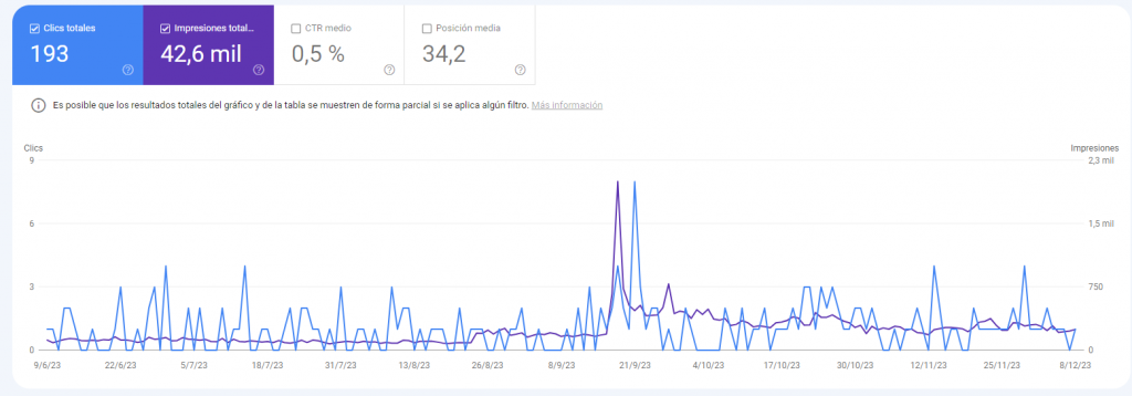
In reality, Google Search Console is more than a tool; it’s more like a repository of tools and tests with different purposes. However, in broad terms, we can identify two main areas. One part allows us to see how Google “sees” our site, and the other is the “performance” part, where we can see how Google is using our site in its search results. This latter part looks something like this:
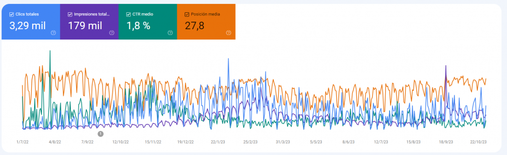
This is a page with low organic traffic where we can find the four metrics we’ll be dealing with in GSC. Google allows us to manipulate the dates and apply various filters. We’re going to focus on two metrics for simplicity: impressions and clicks. In this property, it looks something like this:
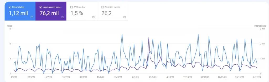
Alright, this is the total volume of impressions and clicks for the site. Now, let’s check, for instance, how many of these searches correspond to branded traffic. Since this is a personal site, we’ll consider the name “Miguel” as the “brand.” So, we’ll filter the number of searches that include the word “Miguel.”
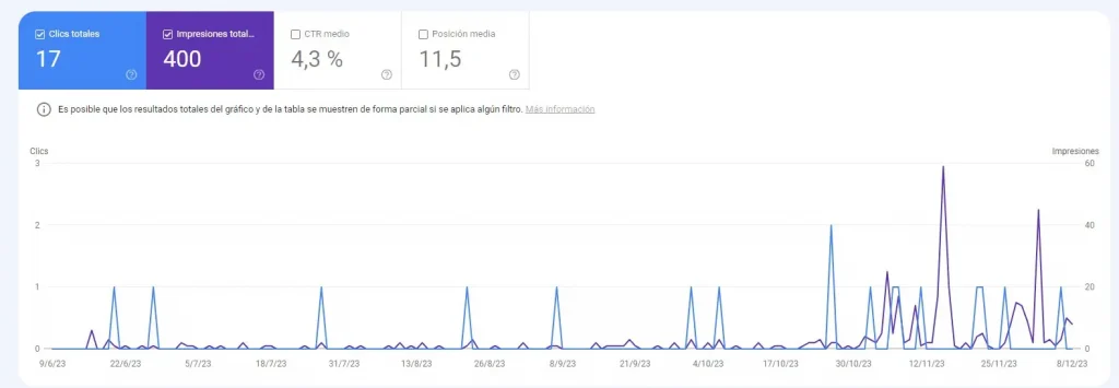
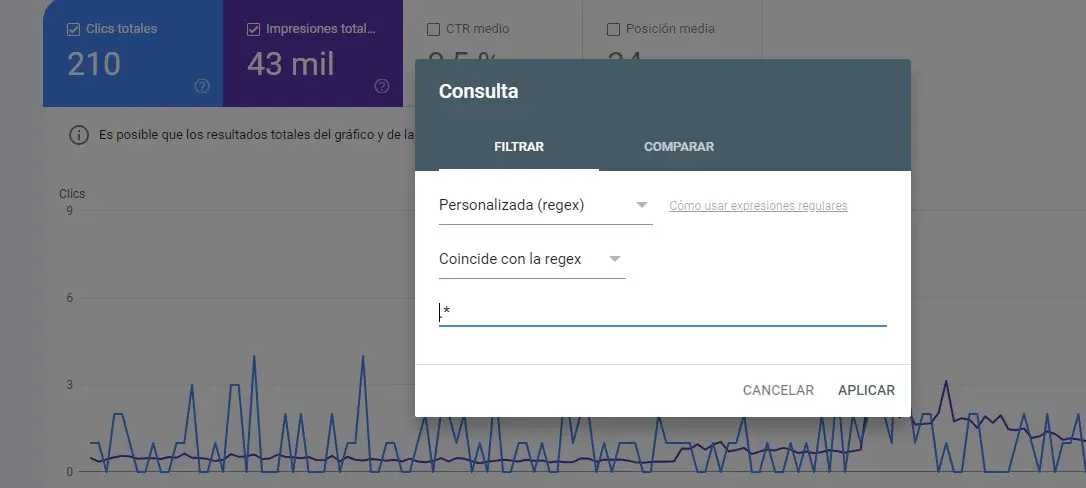
Perfect. It’s not a lot, but it is what it is. Now, let’s see how many of those clicks were generated from searches that do NOT include the word “Miguel.” The result is:
Obviously, something doesn’t add up. If we have a little over 1k clicks, of which 17 correspond to searches that include a term and 193 to searches that do NOT include that term, we are totaling 210 clicks, just around 20% of the total number of clicks.
Let’s try another exercise. This time, we’ll use a regex to request all searches that include any character. We apply the filter, and this is what we have:
In its documentation, Google explains that a certain number of queries are anonymized. However, it’s not easy to determine which queries are anonymized. The documentation I’ve found is quite ambiguous on this matter.
Anonymized queries are those that aren’t issued by more than a few dozen users over a two-to-three month period.
Link to Google’s documentation
So, although we don’t have a very explicit definition of the types of queries that are anonymized, we can assume that it is a phenomenon that affects sites with a high percentage of small searches. In other words, it affects “longtail” searches more.
“The gods must be crazy” or how my Looker data changes between charts
When Looker data is not consistent between tables, I believe there are two clear candidates to blame for the difference. One is the data source. In this post, I wrote about how Google Search Console data can vary significantly depending on whether the selected table is the URL or site table when using the Looker connector for Search Console. Here, we’ll address the other common suspect: whether or not query data was included when creating the chart.
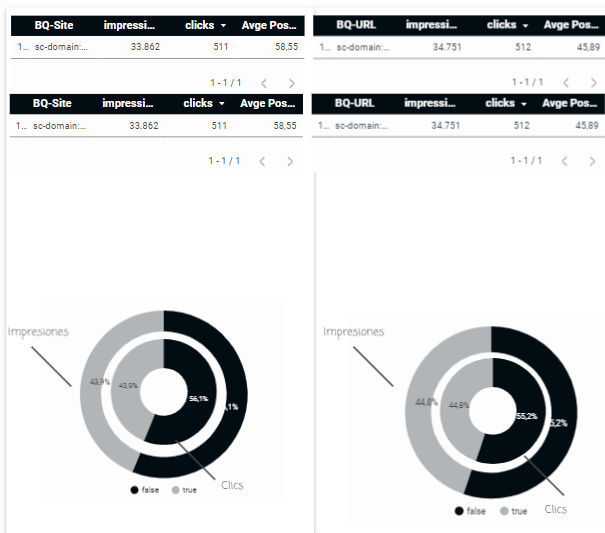
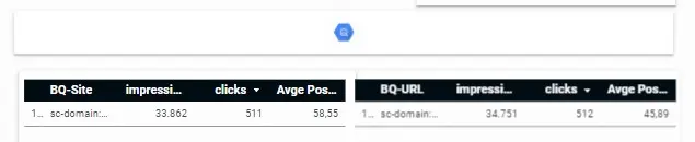
To determine the extent to which the number of anonymous queries can be relevant on a site, we’ll use four different data sources. We’ll examine the GSC data using the Looker connector for both site and URL tables, and then we’ll look at the same period using the data we’re exporting to a BigQuery container.
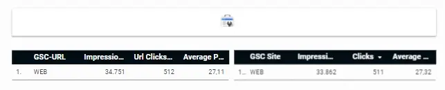
As you can see, the data align as they should. In each case, we have the same number of impressions and clicks, whether through the Looker connector or the BigQuery container. Now, let’s include the number of queries as a metric. We add the number of queries to the table, and we get this result:
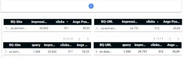
In the case of the Looker connector, when we include the number of queries, it adjusts the data and only gives us the number of impressions and clicks that correspond to those queries. In BigQuery, on the other hand, although the number of queries it provides is the same (i.e., non-anonymous ones), it maintains the total sum of impressions and clicks.
In the following chart, you can see the weight of anonymous searches within the total site traffic. In this case, we’re hovering around 50%. Not bad.